Mapping the News Landscape
The Influence of Ownership on Media Coverage

OUR MISSION
Media bias is hard to quantify since it is generally subjective and heavily depends on human perceptions. We therefore developped a fully automated method that maps the digital news landscape, based on historical publishing data. In short,
- We propose a model of the media landscape that automatically maps news sources based on their selection of subjects.
- By tracking sources' evolution over time, we identify driving forces, from the influence of ownership to large-scale content diffusion patterns.
- We produce a dynamic map of the media landscape over the last 3 years, based on coverage from 500M articles shared by around 8K sources.
THE PROBLEM
The digitalization and globalization of our news channels have had a profound impact on worldwide information diffusion. Nowadays, information
is processed in mass by large organizational structures, before being propagated to local channels.
This process often obfuscates the origin of a news story, blurs the accountability chain to the author of its coverage,
and reduces the traceability to its inception.
Large broadcasting groups have recently been suspected of massive consolidation of resources, pooling resources to reduce the cost of producing stories.
Unfortunately, this reduces the diversity of coverage that reaches the viewer, with multiple local channels sharing the same
selection of news, pruned by actors often unbeknownst to them.
The lack of diversity and accountability can be worrisome, particularly when this content is ideologically charged, as has recently been exposed by John Oliver in his show Last Week Tonight (HBO). This surreal footage shows journalists all reading the same scripted text, provided by Sinclair Broadcasting Group, a large conglomerate of local sources, about ... the lack of diversity in the news.
In our work, we proposed an algorithm to automate the tracking and the monitoring of broadcasted news content.
One of the main difficulties in the development of such a method is the absence of ground truth:
any selection of events is partial by nature and is only comparable to the selection made by other channels.
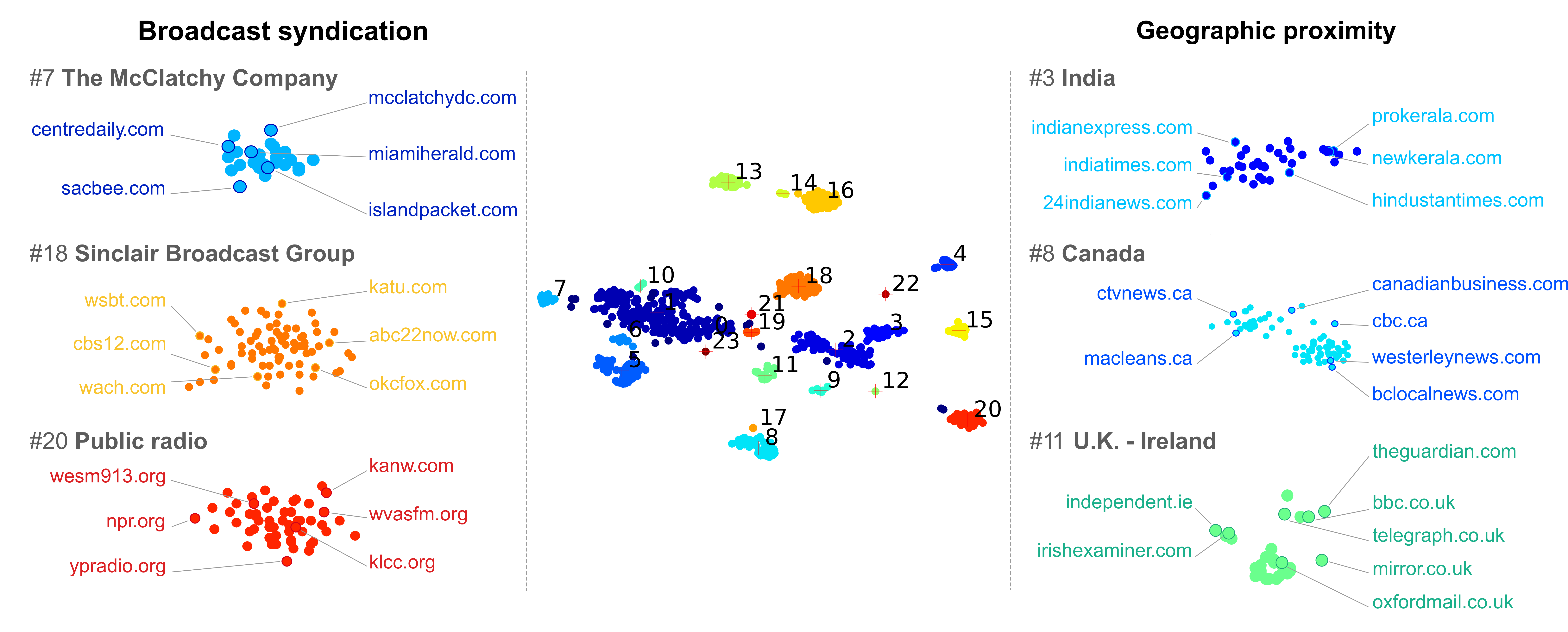
Therefore, our method compares the coverage of events across news entities. This produces a similarity map, where distances
between channels represent the similarity of their coverage. An example map is shown in Figure 1.
The map reveals a structure that is directly derived from coverage. This means we can identify common patterns in sources' coverage after the fact, i.e. without any assumptions on
what they may be. In other words, we do not bias the search for biases.
Through analysis, we uncovered topical factors such as sources' geographic relationships - local sources cover similar events - or thematic regards.
Interestingly, we also reveal the influence of higher-order broadcast structures, evidence for the influence of large corporate actors in local news.
Isolating these patterns is far from obvious, particularly given that a source's branding does not always reveal its affiliation: large broadcast entities
like Sinclair own franchised outlets, often household names like Fox or ABC. Our method provides transparency to the viewer, going beyond surface branding to
reinstate accountability towards the true origin of the broadcast content.
Technically speaking, our method borrows from the field of personalization with a set of techniques commonly used in recommender systems,
such as those used on Amazon or Netflix. The intuition is that we can model a source's selection of covered news as a preference problem:
the editor selects or chooses the events that are most relevant to their audience.
As such, the algorithm tries to predict the likelihood of a channel covering a given event. To do so, it observes
which other sources have selected it, trying to mimic the behavior of sources similar to that which it is trying to model.
In a sense, the algorithm learns a fingerprint of each sources' coverage patterns so it can match it to other similar ones.
These coverage profiles can then be compared to uncover similarities in the choice of their reporting,
usually indicating the presence of a common bias. In sum, sources appearing close together on the map are likely to have a very similar selection of events.
An EVOLVING MAP

We have shown how we can generate a comprehensive map of the news ecosystem from a selection of reported events. However, this first method only
provides a static view of an inherently dynamic system. As the media landscape is always evolving, we need a more complete model which
takes into account the dynamics of the news ecosystem. We extend the ideas that provide us with a static snapshot to produce an evolving map of source
similarity. It highlights
important changes that occur when channels modify their news coverage habits. The external or internal forces driving this change can also
be isolated to better understand influences on the media ecosystem.
For example, we demonstrate the method's potential for news monitoring applications and investigative journalism by shedding
light on important changes in programming induced by mergers and acquisitions, policy changes, or network-wide content
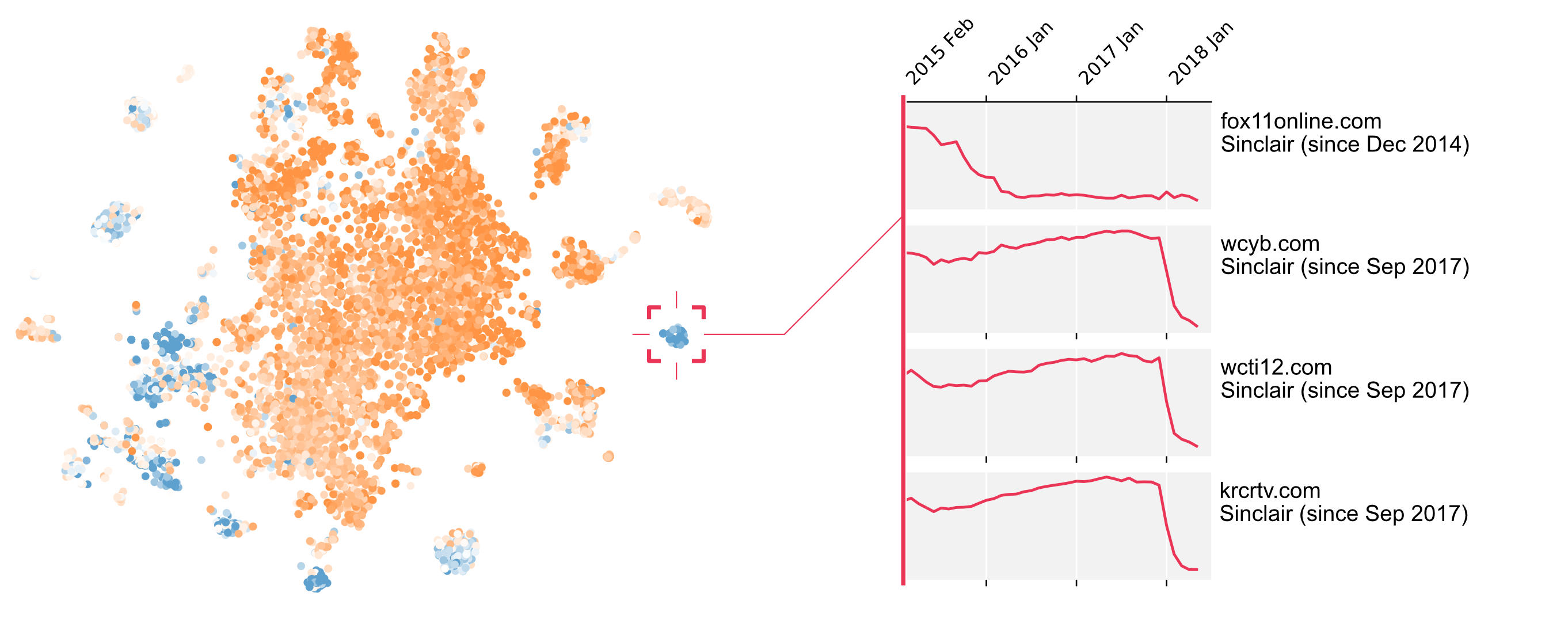
diffusion. An example of the phenomenon is shown in Figure 2: news sources tend to agglomerate into
cohesive clusters after their acquisitions by three well-known news companies, clearly showing the consolidation of resources
taking place in the background and the uniformization of information channels.
DETECTING HIGHLY INFLUENCIAL BROADCAST GROUPS

One of the most common observable patterns is the convergence of a group of sources towards a specific position: as the similarity of
their selection of news increases, the model will highlight their increased similarity. We propose an automated method to detect this
phenomenon by introducing the notion of attractors: the algorithm identifies regions of the map toward which many sources converge.
Regions with a high potential of attraction are shown in blue in Figure 3.
Once identified, the attracted news sources, which are converging towards an attractor, can be monitored. For example, the acquisition
campaign performed by Sinclair in September 2017 can be visualized on the right-hand side of Figure 3. The distance from
four sources to the attractor is abruptly reduced, suggesting an alignment of content post-acquisition.
PUBLICATIONS
CONTACTS
Don't hesitate to reach out to info@mediaobservatory.com for more information or resources regarding this work. To follow our research, and stay informed of new work, for example, the upcoming interactive media map, you can register for updates here:Members of the initiative

Jérémie Rappaz
Ph.D. student at EPFL. His research interests focus on predictive methods that involve massive amounts of people.

Dylan Bourgeois
Masters Student at EPFL, currently working towards his masters’ thesis at Stanford University. He focuses on the application and implications of Machine Learning in different disciplines, with work in news bias characterisation, robotics or high-energy physics at CERN.

Karl Aberer
Karl is a full professor at EPFL and head of the Distributed Information Systems Laboratory.